
The all-new control chart makes it easy for teams to better understand their delivery pipeline to help optimize their process. It highlights differences in estimate and delivery time so that the team can continually make better estimates and deliver more reliably. Today we’re going to explore how it can help your team, but if you haven’t read the overview article on new control chart yet, start there.
1. Dig into your data!
The new control chart is interactive, which makes it easier to dig into your team’s data. Users can click on individual issues to see detailed data around that issue’s time in flight.
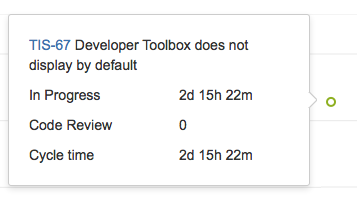
The new pop-up shows the amount of time an issue spent in each state, making it easy to see where bottlenecks and slowdowns occur. The most successful teams minimize the amount of time in each state, enabling a smooth delivery across the feature development pipeline. We’ve also made it easier to dig into data in the control chart. Do you see something you’d like to understand in more detail? Just select the relevant data in the control chart in Jira Agile, and the report will automatically zoom in, giving greater detail.
2. Watch out for long-running issues
Long-running issues are the single biggest impediment to a predictable flow for your development team. They’re also a significant tax on the team, as they generally force more work to be in progress. Teams with shorter issue cycle times focus more consistently and deliver work more reliably.
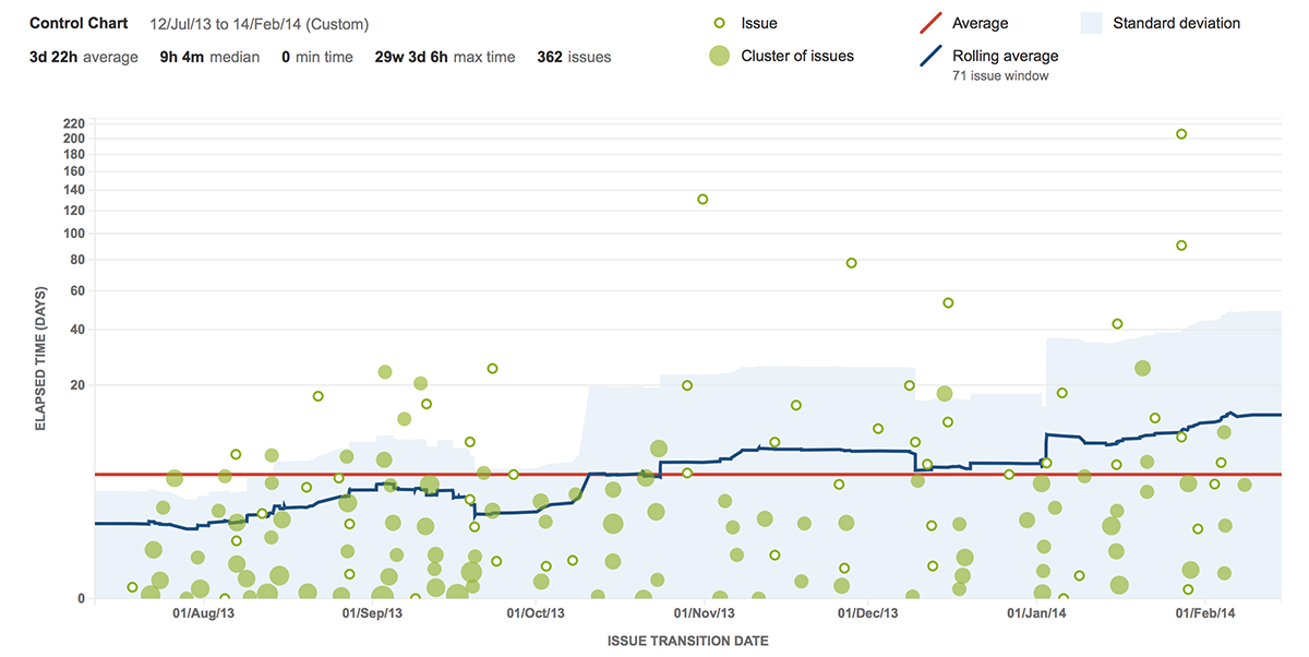
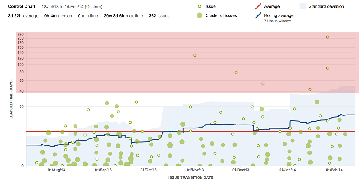
Let’s take a look at a team’s control chart with a number of long-running issues in their history.
 We can see that this team takes about 10 days to move an issue from in progress to resolved (or back to todo). Note that this doesn’t mean that it takes 10 days of work to resolve a particular issue. If a user has two issues in the in progress state for ten days, then both issues will have a ten day cycle time on this chart regardless of how much work is actually done. If you’re interested in how much time a person invests in an issue please see time tracking in Jira.
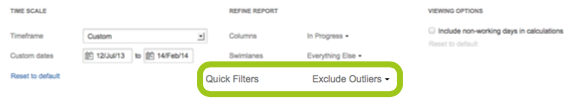
If your team is new to the control chart, there may be issues you want to remove from the chart as they skew the data in a non-meaningful way. We call these issues outliers. As your team becomes more proficient with the control chart, outliers should become less and less common. You can use labels to easily tag these issues and create a quick filter to exclude them from the control chart.
Outliers on the chart above can be easily seen in the red area. This team is new to the control chart, so we want to take out the obviously skewed issues.
We can create a quick filter and tag each of the issues with the label “outlier” to remove them from the control chart. The JQL for the quick filter is:
labels not in ("outlier") or labels is EMPTY
We can apply the quick filter using the controls at the bottom of the control chart.
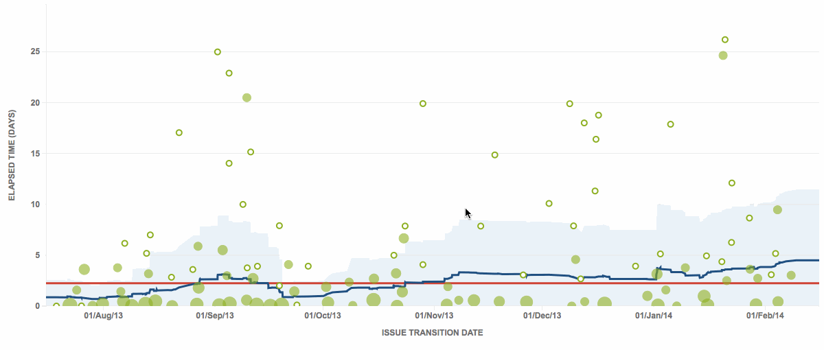
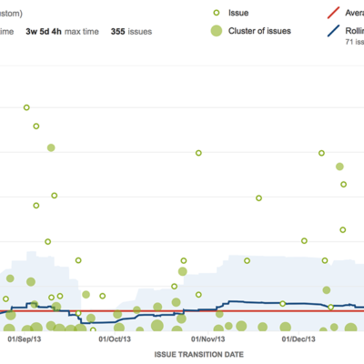
 Looking at the control chart now, we can see a much more accurate picture of the team’s day-to-day progress through the in progress state. Notice the values on the y-axis (highlighted). Without the outliers, we can see the team’s average has dropped to three days per issue.
 3. Make better estimates
Many teams use story points to estimate issues in the backlog. Story points allow flexible yet simple methodology for rating the complexity of issues against one another. A common method of story pointing is to use Fibonacci numbers as story point values. Using numbers like 1, 2, 3, 5, 8, and 13 provide an easy distribution of complexity across the backlog.
How can we hone the team’s ability to make better estimates from the learning of prior iterations? Using a quick filter, we can easily see all of the issues having a story point value on the control chart. The control chart tracks the amount of time those issues were in progress. In theory, we should see a very consistent average as well as band of standard deviation throughout the chart. In practice though, there’s usually some variance throughout a single story point estimate value. Using the data set above, I’ve constrained the view to only show issues that have a story point value of 5. Our quick filter uses the following JQL:
"Story Points" = 5
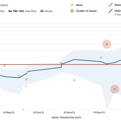
Understanding which issues were far above and below the mean (highlighted) can help the team learn which issues were better served as a value of eight on the high-end and three on the low-end.
4. Exclude issues that don’t get fixed
Issues can be divided into two main categories: issues that get fixed, and those that get resolved without code change (invalid, duplicate, will not fix, etc.). Issues that are resolved without code changes usually get resolved significantly faster, since it’s generally much easier for an engineer to decide not to fix an issue. Including these issues can bring down the moving average significantly. We can easily filter them out using the following JQL:
resolved = "Fixed"
It is a good practice to look at both data sets. You can also see only issues that didn’t get fixed to see that those issues are being resolved quickly and not taxing the team.
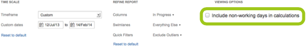
5. Only show working days
Many teams have consistent work days from week to week. Configuring Jira Agile to only show work days makes the control chart more relevant to your team’s work culture. You can configure this option at the bottom of the chart.
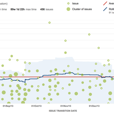
Let’s now take a look at the control chart showing all working days.
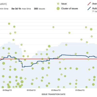 We see the most significant increase in the bottom of the chart. The average cycle time has risen by about 1.5 days (highlighted). Issues are artificially taking longer to resolve as the control chart is calculating time when the team is not actively working. You can configure work days and holidays in the configuration of the Jira Software board.
Distributed teams that have offices throughout the globe working on the same backlog may choose to not use this feature. These teams have someone working on the issue queue at all times. These teams are unique as many different developers work on the same issue and handoffs are common. Thus, the time off features are less relevant for these working configurations. If the assignee does not change over a regular time off period (ala a weekend, not vacation) your team should not include non-working days on the control chart.
6. Focus by status
The control chart can be used to track time by status. Typically the control chart is most valuable analyzing in progress states where the team is actively working on an issue. For example, if we include the to do state which has all the issues in the backlog as well we can see that the elapsed time per issue blown way out to 600 days!
I’d advise looking at each in progress status independently as well as in aggregate. You can configure the control chart to show a single or multiple statuses in the options below the chart.
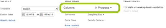
For teams that have separate code and quality review states, the control chart can differentiate between the states to tease out where issues are blocking up. Understanding and unblocking these inefficiencies will make the team more productive minimizing the amount of work in progress.
Learn more!
Interested in learning more about metrics? Head over to The Agile Coach and learn about how to track and share sound agile metrics to reduce confusion and shine a light on your team’s progress.